A residential HVAC company's average ticket metric was built on just three completed jobs in a month, so one big install or one small callback could swing the number by fifty percent. Here's how a five-job minimum and a filter fix made it trustworthy.
Here's a number worth stress testing at your own shop: your average ticket. Not because the metric is a bad idea, it's one of the more useful things you can track, but because most owners never ask how many jobs are actually sitting behind the number on the dashboard. If the answer is three or four, you don't have an average. You have whatever the biggest job of the month happened to cost, dressed up to look like a trend.
That's roughly what was happening at a residential HVAC company running separate service and maintenance departments on ServiceTitan. The company used average ticket as one of the core numbers behind its technician performance plan, the kind of metric that quietly determines whether a tech's month reads as a good one or a forgettable one. On paper, it looked like a clean, objective number pulled straight from the data. In practice, it was standing on a sample size so small that a single job could tip it in either direction.
Five Completed Jobs, Three That Counted
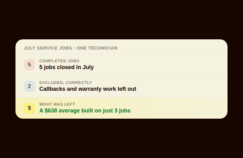
In July, a service technician closed five completed jobs. A reasonable person would assume all five fed into that tech's average ticket for the month. Only three did. The other two were callbacks, jobs ServiceTitan hadn't flagged as "opportunities," which is the field ShareWillow's sync was using to decide what counts toward the average. Callbacks and warranty work often carry a $0 or reduced value, and for good reason: nobody wants a tech's numbers dinged for going back to make something right. But when those jobs simply vanish from the sample instead of being handled deliberately, the average left behind isn't smaller, it's just less real.
Three jobs is not a sample, it's a coin flip. Drop one $1,300 install into that group and the average jumps hard. Drop in a $400 tune-up instead and it falls just as hard, in the opposite direction. The technician performance report was showing an average ticket of $638 for the month, built almost entirely on whichever two or three jobs happened to close during that stretch. It wasn't a lie exactly. It was math doing exactly what math does with too little to work with.
Three jobs isn't an average. It's whichever job happened to be biggest that month, wearing an average's clothes.
There was a second problem hiding underneath the first one, and it was arguably the more consequential of the two. The technician performance report was filtering by the technician's assigned business unit rather than the business unit tied to each individual job. That sounds like a small distinction until you see what it does in practice: a technician who primarily runs service calls but occasionally picks up a maintenance visit would have that maintenance job's lower ticket value pulled straight into the service average, dragging a number that was supposed to measure service performance down with a job that was never really service work to begin with. Two technicians doing identical service work could end up with meaningfully different averages depending on how many maintenance visits happened to land on their schedule that month, something that had nothing to do with how well either of them worked a service call.
None of this showed up as an obvious error. Nothing crashed, no number turned red, no alert fired. It just sat there quietly shaping how technician performance got measured, the same way a scale that's a few pounds off doesn't announce itself, it just makes everyone who steps on it slightly wrong in the same direction. We've written before about what happens when a plan's underlying metric drifts out of sync with reality, like the HVAC shop that discovered its commission tiers had quietly become unreachable in a separate tiered commission rebuild. This was the same category of problem wearing a different metric: not a broken formula, a broken sample.
A Minimum Sample Size, Not a New Formula
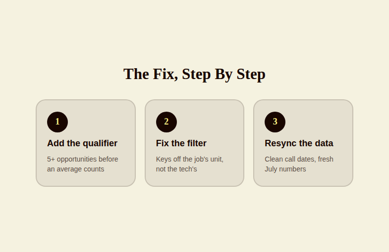
The fix wasn't a philosophical overhaul of how average ticket should work. It was something closer to basic statistics: don't trust an average until it has enough underneath it to mean something. Working directly with the company's operations contact, Michael, ShareWillow added a minimum-opportunities qualifier to the technician performance metric. Under the new rule, a technician's average ticket doesn't count toward their performance number at all until they've closed at least five opportunities in the period, not five jobs, five opportunities specifically, which excludes the callbacks and warranty visits that shouldn't have been diluting the sample in the first place.
Five is not an arbitrary round number chosen because it sounded reasonable. It's close to the minimum sample size where one unusually large or unusually small job stops being able to single-handedly swing the average by fifty percent. At three jobs, one outlier is a third of your data. At five, it's a fifth, still meaningful, but no longer capable of quietly rewriting the whole picture on its own. The qualifier gets applied per department, so service and maintenance each carry their own minimum rather than sharing a single blended threshold that would have made even less sense given how differently the two departments' ticket sizes run.
The second fix ran alongside the first: correcting the business-unit filter so the report keys off the job's business unit instead of the technician's. A service tech's average ticket now only reflects service jobs. A maintenance visit that happens to land on a service technician's schedule gets filtered out of the service number entirely, the way it always should have been, instead of quietly dragging a service average down toward a maintenance price point. ShareWillow added a "number of opportunities" field directly to the technician performance report so the sample size sits in plain view next to the average itself, and re-synced the metric so the corrected numbers would actually reflect the new logic going forward, not just on paper.
There's a real discipline question buried in this fix that's worth naming directly, because it applies well beyond this one company: what should count as an "opportunity" for average-ticket purposes, and who decides? Warranty work and straightforward callbacks usually shouldn't inflate or deflate the number technicians are being measured against, since that isn't really new revenue-generating work. But the moment you start excluding job types from a sample, you also shrink that sample, and a shrinking sample needs a floor underneath it or you've just traded one distortion for another. The fix here handled both sides of that trade-off at once: exclude what shouldn't count, but don't let the metric fire on a sample too small to trust regardless of what's excluded.
This is a pattern that shows up constantly once you start looking for it in trades businesses running performance pay off software-generated reports. A plan built on real job data is only as fair as the definitions sitting underneath that data, definitions like what counts as an opportunity, which business unit a job belongs to, and how big a sample has to be before it's allowed to move someone's paycheck or performance review. We've seen the same category of issue surface as an 80x hours-sync error at a property management company, and as a $76,000 misclassification at a multi-trade contractor. Different symptoms, same root cause: a number that looked authoritative because it came out of a report, when the report itself needed a second look.
Profit sharing
made simple.
Give your team a stake in the company’s success. ShareWillow helps you create and manage profit-sharing programs that motivate employees and drive business results.
What A Trustworthy Number Actually Looks Like Here
The company already had real, specific targets in mind before any of this got fixed: a service average ticket north of $600, and a maintenance average ticket north of $250. Those targets aren't the interesting part of this story. What's interesting is that until the qualifier and the filter fix went in, nobody could say with real confidence whether a technician was clearing that $600 bar because of consistently strong service work, or because one large install happened to land in a short month. The targets were solid. The number being measured against them wasn't.
That distinction matters more than it might sound like on first read. A technician who works hard, does good work, and genuinely deserves to clear that $600 average could just as easily have missed it in a month where a couple of low-value callbacks happened to be the only completed jobs on the books, dragging a three-job sample down through no fault of the tech's actual performance. The inverse is just as true, and arguably more corrosive over time: a technician who happens to land one large job could look like a top performer for a month on the strength of a single sale, while a tech doing steadier, more consistent work underneath a smaller sample gets read as underperforming. Neither outcome has much to do with who's actually doing better work. Both outcomes were fully possible under the old math.
A performance number that can be won or lost by one job isn't measuring performance. It's measuring luck, and calling it a scorecard.
Michael and the ShareWillow team didn't stop at fixing the formula and calling it finished. Part of the follow-through here was going back through July's call-date data specifically to make sure jobs were dated correctly before the metric got re-synced, since a job logged against the wrong date can just as easily corrupt a monthly average as a missing opportunity flag can. That's the less glamorous half of fixing a broken metric: it's not just changing the rule going forward, it's making sure the historical data feeding into that rule is clean enough to trust in the first place. A five-job minimum doesn't help much if two of those five jobs are sitting in the wrong month.
Why This Is Worth Checking At Your Own Shop
If your technicians are paid, scored, or coached against an average ticket, an average job time, a close rate, or any other metric pulled automatically out of ServiceTitan, Housecall Pro, or a similar platform, it's worth asking two blunt questions about it. First: how many data points are actually behind that number in a typical period, not your best period, a normal one? Second: is the filter logic keying off the right thing, the job's attributes, or something adjacent to the job, like which department a technician happens to be assigned to on paper? Neither question requires a data science background to answer. It requires opening the report and counting.
We've covered similar catches before, like the technician performance number that was quietly inflated by a payroll rule bug crediting 71 hours instead of 48, or the family plumbing company that spent ten years unable to pull a KPI scorecard it could actually trust. None of these are stories about technology failing. They're stories about a number being treated as fact simply because a dashboard displayed it with confidence, when the honest answer was that the number needed a floor, a filter fix, or both before it deserved that confidence. Software will hand you a number whether or not that number is meaningful. Whether it's meaningful is still a human question, and it's one worth asking before that number ever touches a paycheck.
Related reading
Conclusion
A dashboard will hand you an average with total confidence whether or not it has enough real data behind it to mean anything, so the real work is making sure it does before that number ever touches someone's pay.
Create incentives
that
drive results
You shouldn't need complex equity plans to align your team. ShareWillow makes it simple to create transparent profit-sharing programs that motivate employees and grow your business.

Incentive plans to help
small businesses thrive.
.png)
"I was able to leverage the knowledge of the ShareWillow team to learn how other companies were designing their bonus plans. The template was extremely helpful."

Brian Tustin
Owner, First Rate Movers